Barry Energy
Barry Energy is a 100% digital electricity supplier that makes it easy for you to get smarter, cheaper, and more climate-friendly power. By providing full insight into your power usage data, you can take full control of your energy consumption.
Comapny:
Barry Energy
Role:
Digital Product Designer
My role
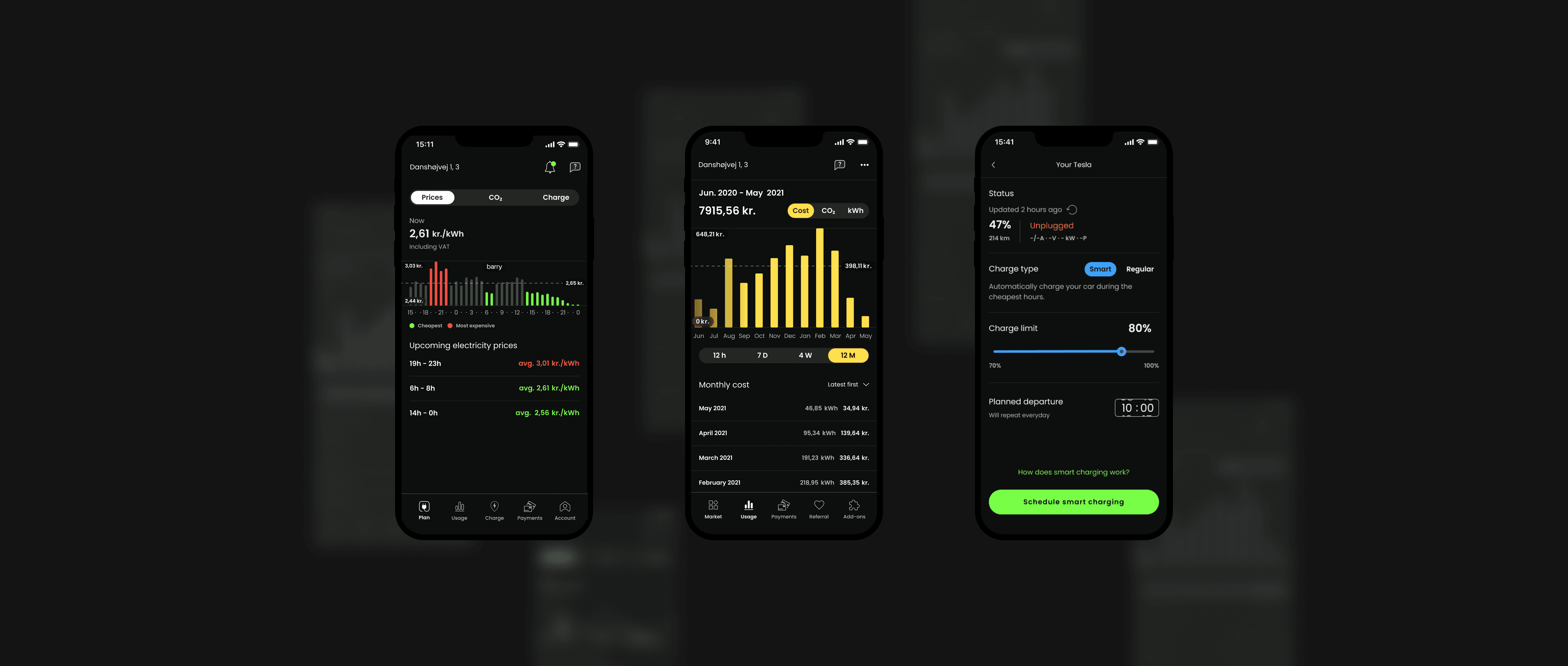
I led the UI design with the accountability of the design system, and directly collaborated with product and development teams on core projects to improve product interfaces and experiences through research, prototyping and testing.
My team included a Project Manager, User Researcher, UX copywriter, and me. Below is an example of a project I worked on:
Home screen redesign
Prior to joining the team, the company completed a rebranding. Many elements needed a redesign, including the app's home screen. The project started by analysing the home screen and feedback from users, gathered by our UX researcher.
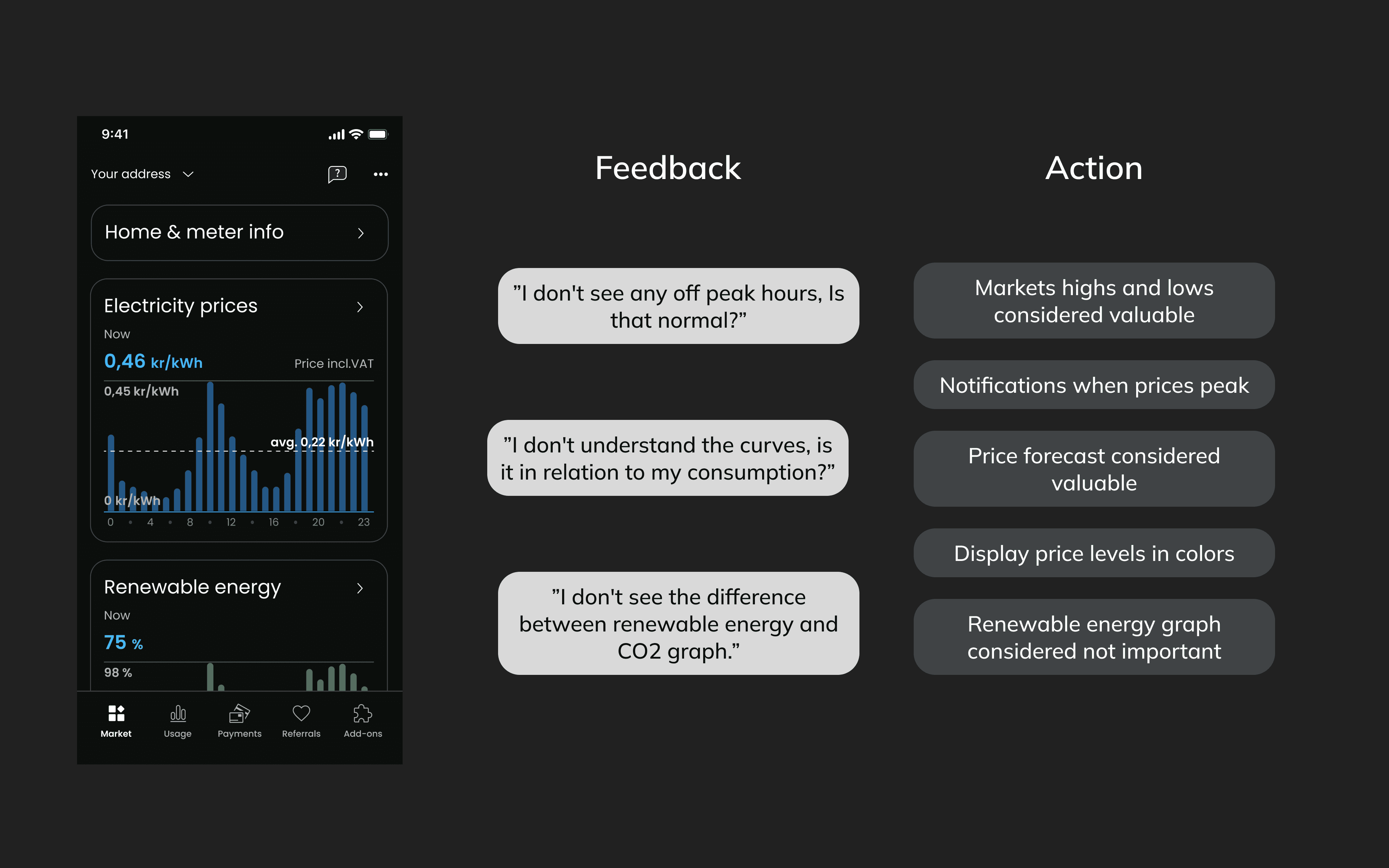
After reviewing user feedback, we began brainstorming ideas with a focus on redesigning how the data was being displayed. Our goal was for the user to easily understand the electricity prices by providing a clean, intuitive and simple design.
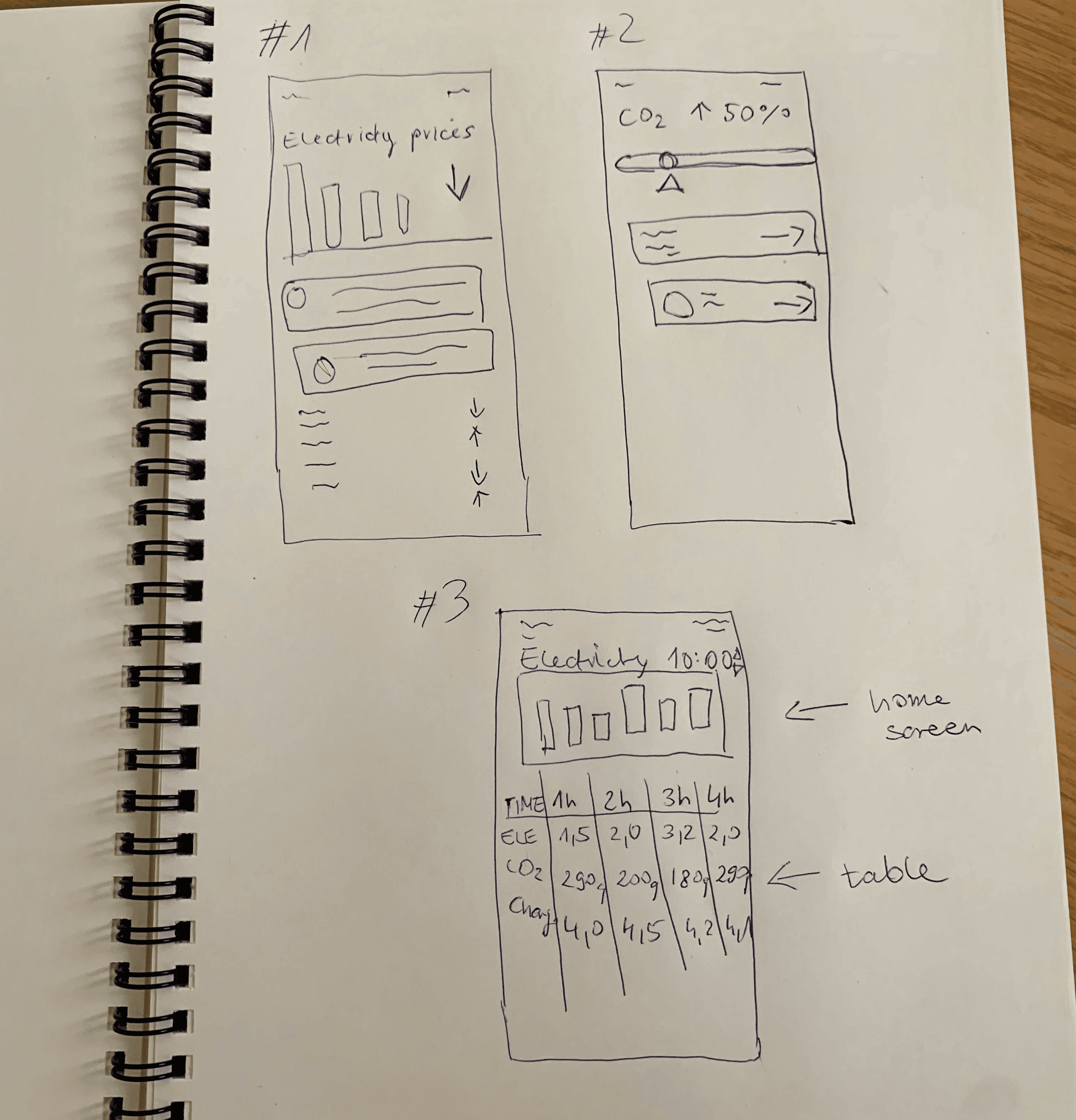
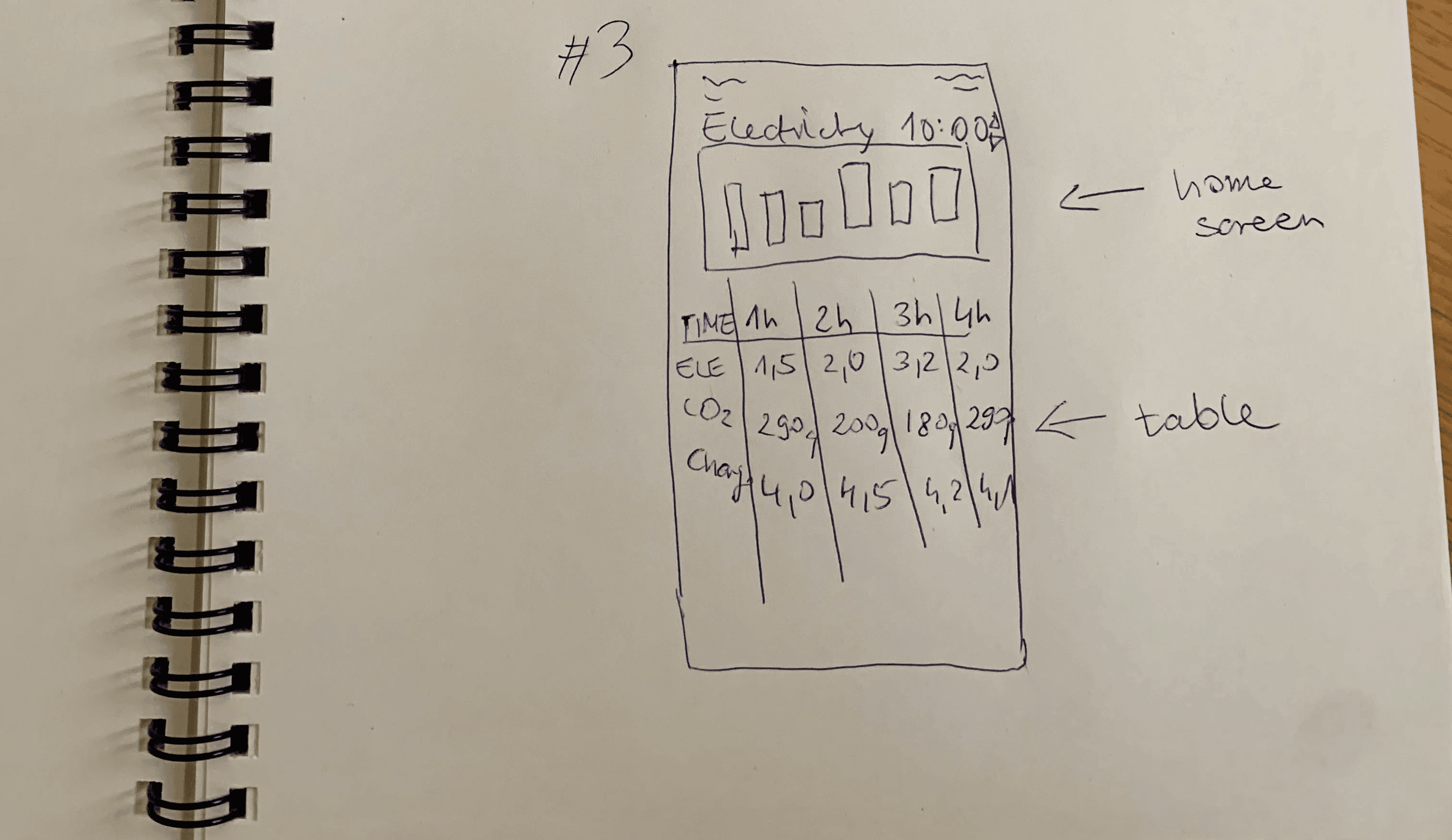
We began the brainstorm process by analysing users responses, and sketching ideas. We presented and gathered feedback for these refined sketches and voted on specific features we thought would best solve our customer problems.
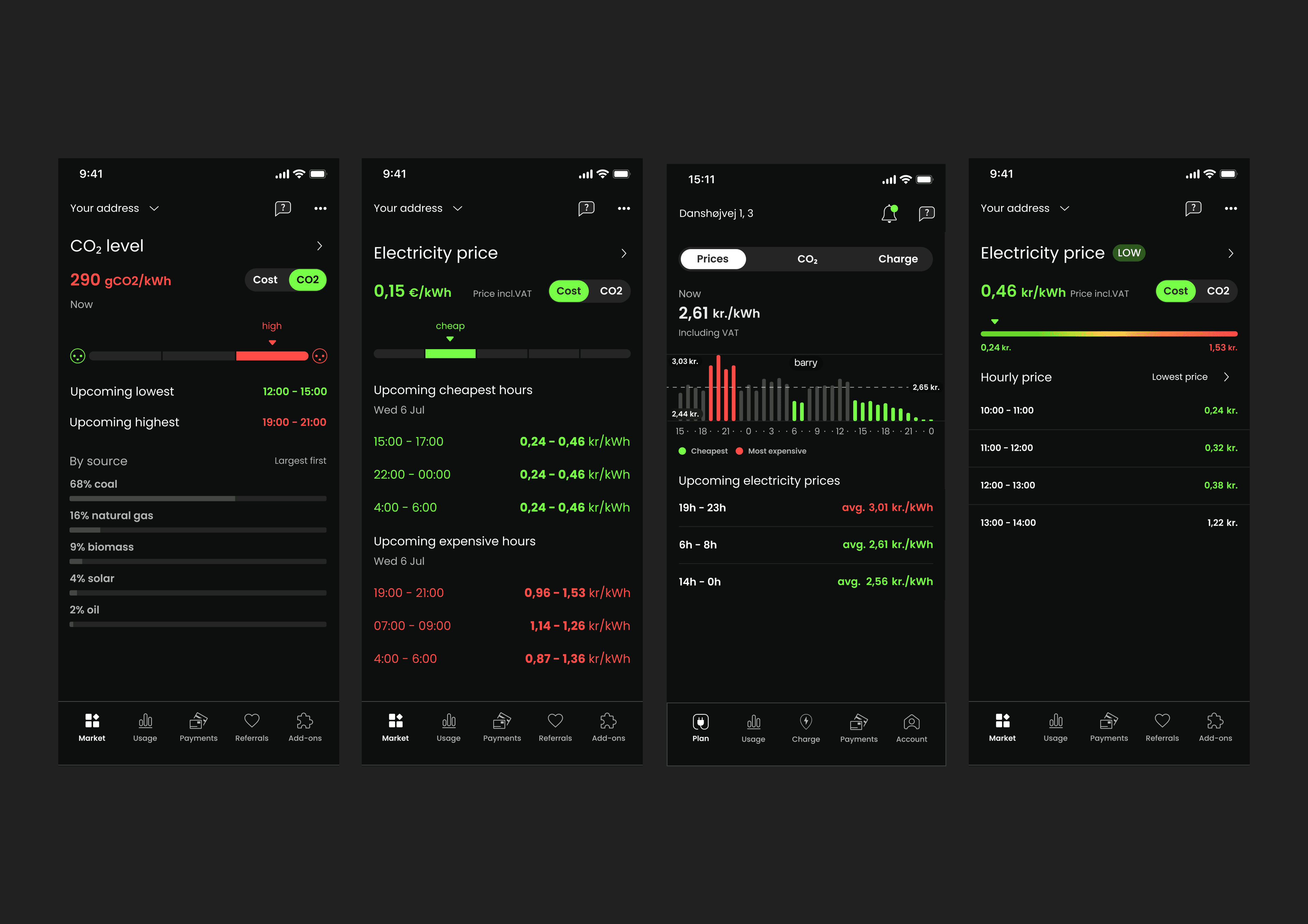
After many feedback sessions, we were ready to test 4 different layout with our users and see which ideas could help our customers best.
Initial testing showed us that we were heading in the right direction, but we overcomplicated some of the elements. With a new focus, we continued on working with the same use of colour, but a slightly different structure.
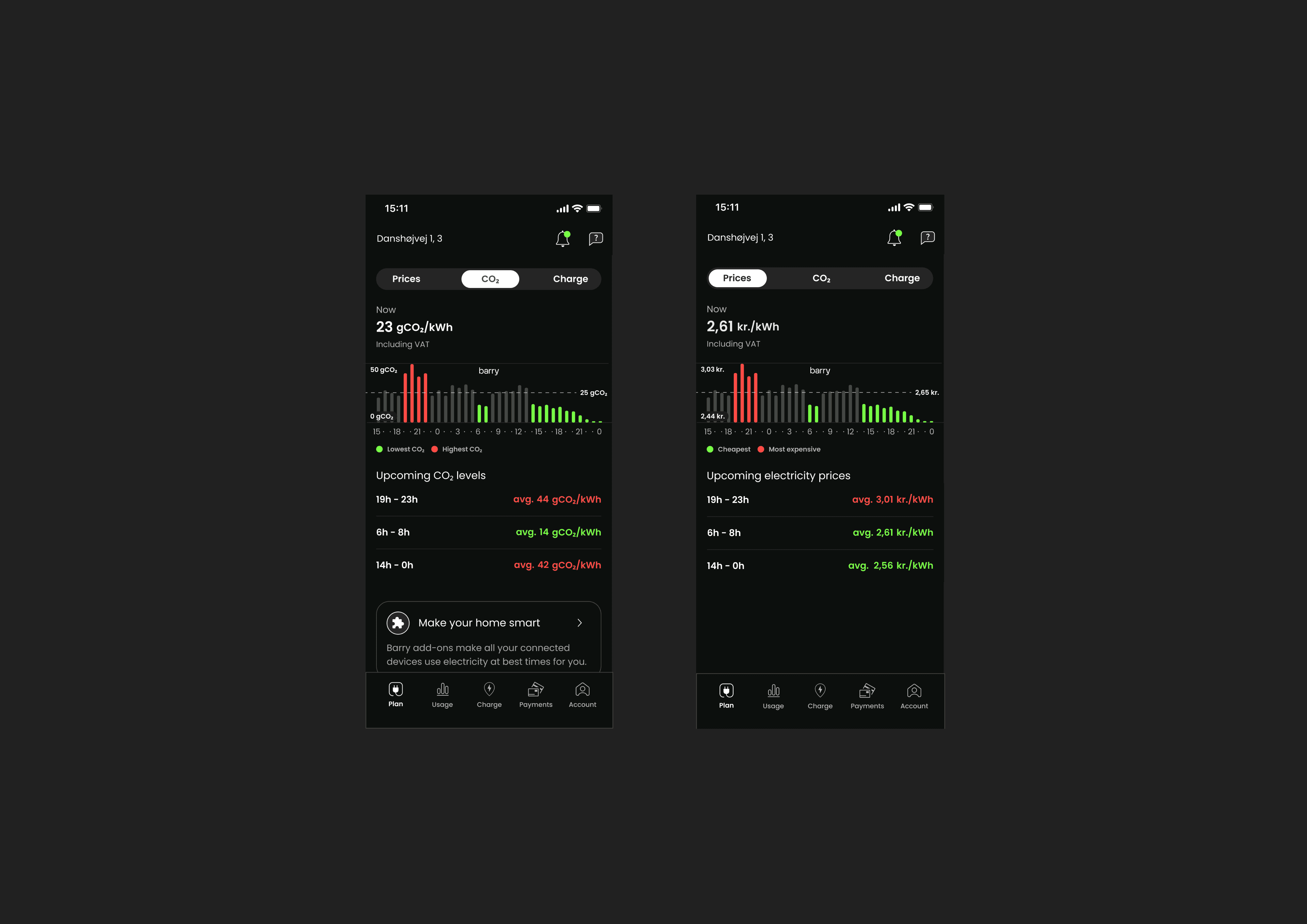
We ran usability tests to validate if our solution worked well. Using our prototype, we asked testers to explain what they can see on the screen, read the data and how would they interact with a newly proposed home screen.
Key takeaways
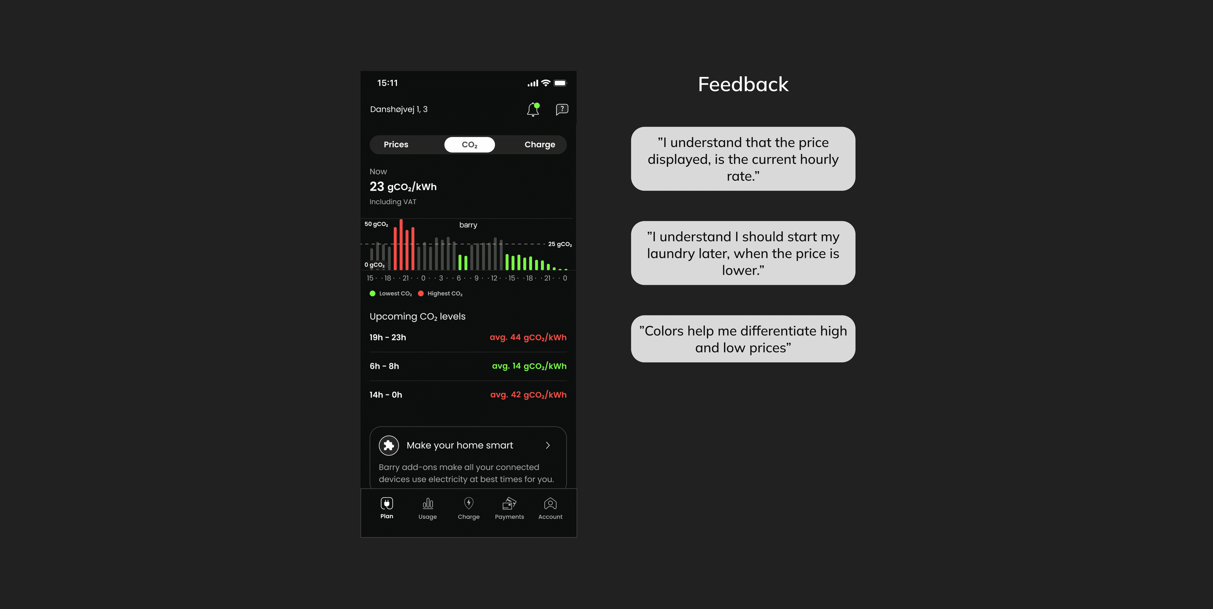
Our new home screen design was met with a positive reaction. Feedback has confirmed that the user is now able to understand the current electricity market at a single glance. The use of colour makes it very easy to see when to use, and when not to use power.
